
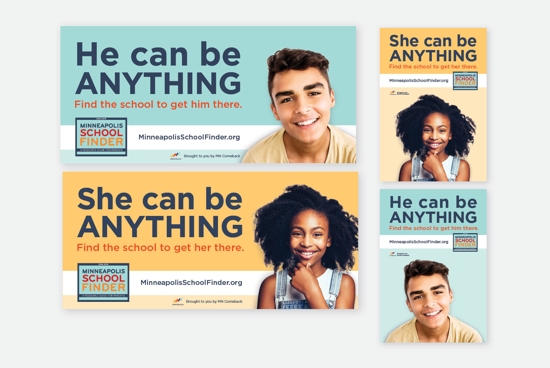
For MN Comeback's 'Minneapolis School Finder' campaign, I designed a billboard and bus stop campaign to raise awareness of their annual booklet, which provides parents with key information about local schools. Given the limited budget, we utilized stock photography carefully selected to represent the primary demographics, then edited it extensively to achieve a custom, cohesive look.
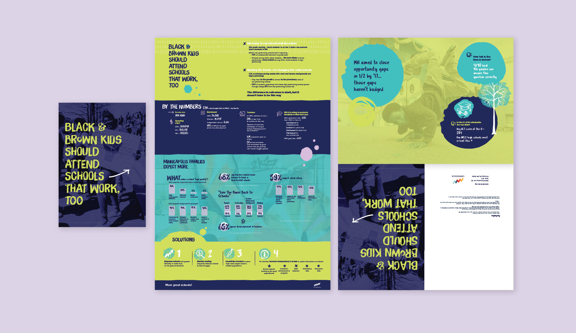
For this multi-purpose piece, created for MN Comeback, I designed a bold, eye-catching folding mailer that also functioned as a brochure and poster, carrying the message: 'Black and brown kids should attend schools that work, too.' The design was crafted to appeal to a younger school-aged audience while effectively engaging parents and the community. Infographics highlighted key challenges and solutions for students of the target demographics, making the information clear and actionable. The vibrant, youthful aesthetic ensured the message stood out, while the flexible format maximized impact across different distribution methods.
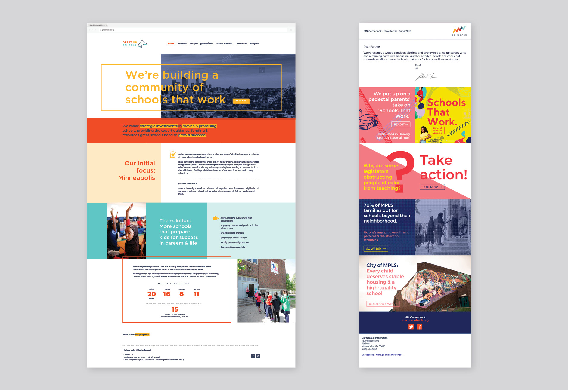
I collaborated with key stakeholders at Minnesota Comeback to redesign their website landing page, creating a more minimal yet impactful design that clearly communicated their main message and key goals. Additionally, I designed an e-newsletter for MN Comeback, built for the Bloomerang platform. To elevate the email design beyond standard templates, we pushed the platform’s capabilities and worked with a specialized developer to bring the vision to life.
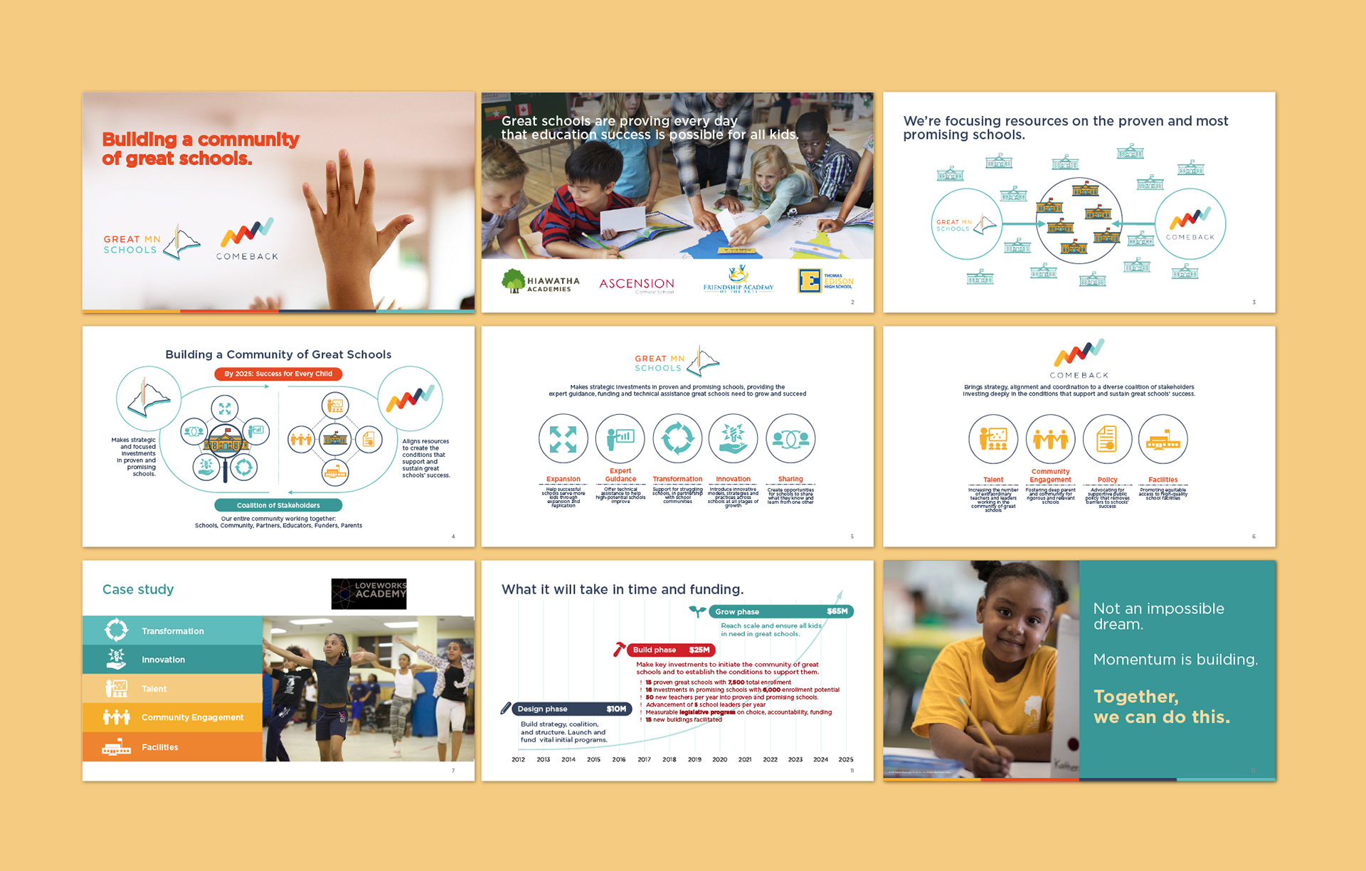
Select slides from a funder's PowerPoint deck for Minnesota Comeback, designed for pitches to funders and stakeholders. The deck featured a vibrant design with real images of students and dynamic infographics that clearly outlined the educational challenges, the impact of the initiative, and the funding 'ask.' The visuals were crafted to be both compelling and digestible, ensuring key messages resonated with potential supporters.
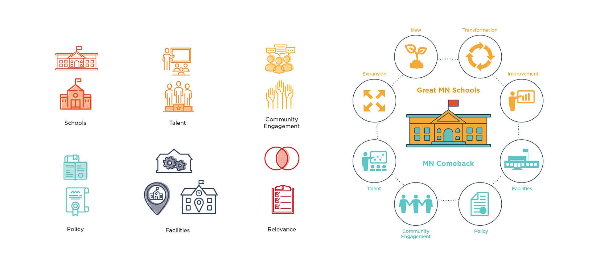
Icons and infographics for MN Comeback, featuring key concepts related to the org's mission, designed to be featured in presentations and print materials.
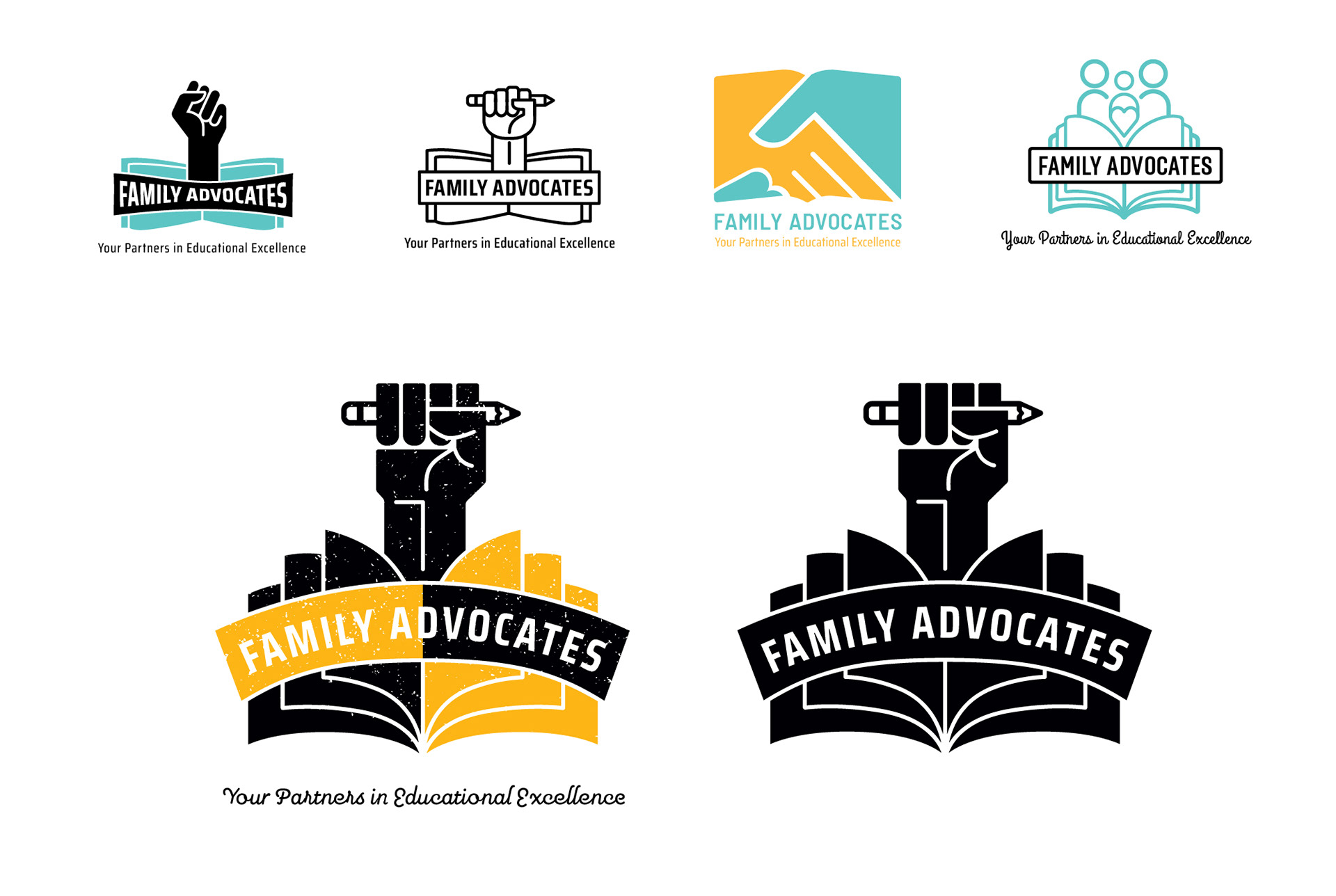
Initial concept explorations, and then the final logo versions for Family Advocates, an organization that supports parents and families in navigating the Minneapolis school system. The client sought a balance between a fresh, urban aesthetic and a timeless, classic midcentury feel. I created both a clean version and a distressed version for various uses. The final logo clearly conveys the organization’s mission through a strong, meaningful icon that reflects strength, learning, and support.
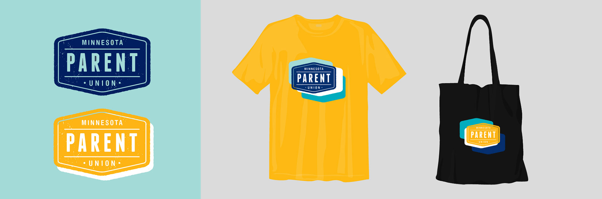
A logo design and application mockups for Minnesota Parent Union, designed to reflect the organization's commitment to empowering families and advocating for educational equity.
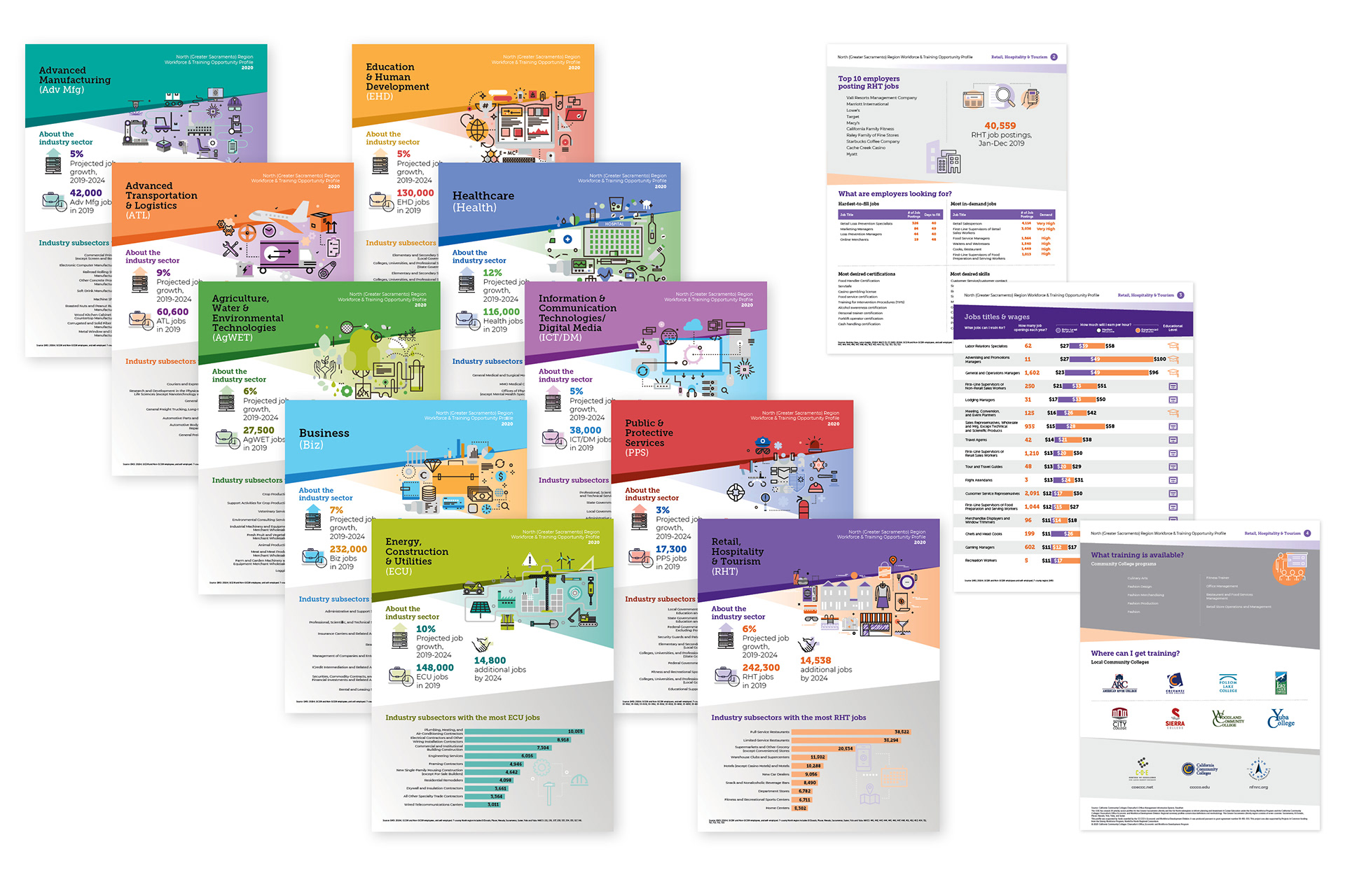
Four-page Job Report flyers designed for the California Centers of Excellence (COE) for the North (Greater Sacramento) Region. These Workforce & Training Opportunity Profiles help job seekers navigate their educational paths through California Community Colleges by highlighting in-demand jobs across various sectors. Each report features key data on employment opportunities, potential employers, salaries, and required education, ranked by demand. I designed the reports with vibrant vector infographics and illustrations to make critical information engaging and accessible while ensuring alignment with the COE brand.